以下css代码可以控制文字超出显示区域时裁剪为省略号:
{white-space:nowrap; text-overflow:ellipsis;overflow: hidden;vertical-align:top;}
前三个属性缺一不可。
需要注意的是,chrome中加上overflow:hidden之后可能会导致右侧的元素上下错位,加上vertical-align属性可以解决。
刚才看到本站页面中,body的background-size是cover。这个值只是以前看到过,没了解过,于是百度了一下:
cover值会保持图像本身的宽高比例,将图片缩放到正好完全覆盖定义背景的区域。
于是我产生了一个疑惑,cover和100%有哪些区别呢?实验一番之后明白了。
注意,background-size:100%;和background-size:100% 100%;是不同的,本文讨论的是只写一个100的情况,形同background-size:100% auto;。
先看100% auto的效果:
可以看到100% auto并不是把图片的宽高都缩放到区域的100%,而是以宽度为基准(因为100% auto只指定了宽度是100%)进行等比例缩放。如果图片宽度缩放到了区域的100%就不再继续调整了,这时候高度是否铺满、是否超出或不足,就听天由命了。是否平铺取决于background-repeat的设置。
再看cover的效果:
可以看到背景图相比于100% auto时放大了许多,此时背景完全铺满了页面,没有产生平铺;但是有一部分跑到区域外面了。
cover的高明之处就在于没有限制以宽度还是高度作为缩放基准。先把图片等比例缩放,在窄的那一边达到了区域的100%之后,如果另一个边没有达到100%,就继续等比例缩放,直到另一边达到100%。,这样可以保证图片完全覆盖区域,而且无需平铺。但这样可能会造成图片的一部分在区域之外,变得不可见了。
body, dl, dd, h1, h2, h3, h4, h5, h6, p, form,ol,ul,li{margin:0; padding:0;}
body{font-size: 14px;font-family: 'Microsoft YaHei',Arial, Helvetica, sans-serif;color: #333;}
a{text-decoration: none;}
img{border: 0;max-width: 100%;}
a img{border: 0;vertical-align:middle;}
li{list-style: none;}
div,ul,li,p{box-sizing: border-box;}
.clearfix2:after{content:".";display:block;height:0; clear:both; visibility:hidden;}
自己用的,姑且记下来吧,虽然有些地方并不完美。
百度了一些tooltip插件,后来感觉bootstrap的这个tooltip插件比较顺眼,于是鼓捣一番,会简单的使用了。
上例的代码如下:
<script src="http://apps.bdimg.com/libs/jquery/1.9.0/jquery.js"></script>
<script src="/f/bootstrap-tooltip.js"></script>
<link rel="stylesheet" href="/f/bootstrap_tooltip.css"/>
<script>
	$(function () { $("[data-toggle='tooltip']").tooltip(); });	//启用页面中的所有的工具提示(tooltip)
</script>
<img src="/f/穹妹%20小图.jpg" alt="" data-toggle="tooltip" data-placement="bottom" title="不要羡慕我的床"/>
<br /><br />
<a href="saber.我爱你" data-toggle="tooltip" title="这是一个hentai网站">saber酱的抱枕</a>
<br /><br />
<span data-toggle="tooltip" data-placement="right" title="原来saber是我的剑鞘啊~">最爱saber啦~</span>
<br /><br />
<div data-toggle="tooltip" title="练习~练习~">练习~练习~</div>
原理是触发时添加html元素和class类,提示的样式是css实现的,无需图片,所以我们只需要处理代码就行了。
Read More →
代码如下:
html{
    -webkit-filter: grayscale(100%);
    -moz-filter: grayscale(100%);
    -ms-filter: grayscale(100%);
    -o-filter: grayscale(100%);
    filter: grayscale(100%);
    filter: gray;
}
chrome下效果完美,火狐中body的背景图片没有变灰,IE11中完全无效。对于IE应该可以兼容到IE9。
我花了半个多小时,测试了各种方法,除了各种css外,还找过用js创建canvas的代码,或是使用某jq插件,最后也没成功实现全浏览器通吃。css的方法最简单,不过兼容性不怎么让人满意。
chrome是使用了-webkit-filter: grayscale(100%)这一项,火狐中生效的是filter:grayscale(100%)。
IE10和IE11在图像滤镜方面还是比较坑爹的,不能执行filter滤镜,而且连svg滤镜也不支持。
使用chrome的话可以玩玩下面这个小玩意:
可以重复点哦。
代码如下:
<button id="setGray">设置网页的灰度</button>
<script>
$("#setGray").click(
	function setGray () {
		var grayCss="-webkit-filter: grayscale(100%);-moz-filter: grayscale(100%);-ms-filter: grayscale(100%);-o-filter: grayscale(100%); filter: grayscale(100%);";
		var num=prompt("请输入您希望的灰度(正整数)","");
		if (num!=100) {
			grayCss=grayCss.replace(/100/g, num);
		};
		$("html").attr("style",grayCss);
	}
)
</script>
以上真是蛋疼之作,不知道会有地方用到不。
Your sin , I bear
css的font-face功能还没有用过,今天试了试。
<style>
	@font-face {
	  font-family: huati_eng; /*可以自定义字体名*/
	  src: url('src/fontName.ttf');
	}
	#font_test{font-family: huati_eng;font-size: 120px;}
</style>
<div id="font_test">saber</div>
但是IE不支持ttf文件,所以上例在IE中是无效的。(IE中使用.eot文件)
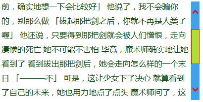
在IE浏览器中,可以设置滚动条的样式。css如下:
#a{width: 400px;height: 200px;overflow-y: auto;font-size: 16px;font-family: 微软雅黑;color: #004506;margin-left: 15px;line-height: 29px;
	scrollbar-track-color:#3DA3EF; /*设置滚动条底板颜色*/
	scrollbar-arrow-color:#f00; /*设置滚动条两端箭头的颜色*/
	scrollbar-shadow-color:#f00;/*设置滚动条句柄的边框颜色*/
	scrollbar-face-color:#A6E22E;/*设置滚动条句柄的颜色*/
	scrollbar-darkshadow-color:#f00;/*无表现*/
	scrollbar-3dlight-color:#f00;/*无表现*/
	scrollbar-highlight-color:#e8f1ff; /*无表现*/
	SCROLLBAR-BASE-COLOR:#f00;/*无表现*/
}
今天上午用chrome浏览器的Stylish扩展修改了百度贴吧的样式,代码如下:
把常用页面改成了透明样式,帖子页面改为宽版,头像改了圆角。设置作用范围为网址前缀:http://tieba.baidu.com/。
Read More →
使用js设置css属性的时候,属性名经常和css的有区别。例如css中的'backgroung-image',使用js设置的时候需要写成'backgroundImage'。下面就是JS和CSS属性的对照表:
| CSS语法 (不区分大小写) | JavaScript语法 (区分大小写) |
| border | border |
| border-bottom | borderBottom |
| border-bottom-color | borderBottomColor |
| border-bottom-style | borderBottomStyle |
| border-bottom-width | borderBottomWidth |
| border-color | borderColor |
| border-left | borderLeft |
| border-left-color | borderLeftColor |
| border-left-style | borderLeftStyle |
| border-left-width | borderLeftWidth |
| border-right | borderRight |
| border-right-color | borderRightColor |
| border-right-style | borderRightStyle |
| border-right-width | borderRightWidth |
| border-style | borderStyle |
| border-top | borderTop |
| border-top-color | borderTopColor |
| border-top-style | borderTopStyle |
| border-top-width | borderTopWidth |
| border-width | borderWidth |
| clear | clear |
| float | floatStyle |
| margin | margin |
| margin-bottom | marginBottom |
| margin-left | marginLeft |
| margin-right | marginRight |
| margin-top | marginTop |
| padding | padding |
| padding-bottom | paddingBottom |
| padding-left | paddingLeft |
| padding-right | paddingRight |
| padding-top | paddingTop |
| background | background |
| background-attachment | backgroundAttachment |
| background-color | backgroundColor |
| background-image | backgroundImage |
| background-position | backgroundPosition |
| background-repeat | backgroundRepeat |
| color | color |
| display | display |
| list-style-type | listStyleType |
| list-style-image | listStyleImage |
| list-style-position | listStylePosition |
| list-style | listStyle |
| white-space | whiteSpace |
| font | font |
| font-family | fontFamily |
| font-size | fontSize |
| font-style | fontStyle |
| font-variant | fontVariant |
| font-weight | fontWeight |
| letter-spacing | letterSpacing |
| line-break | lineBreak |
| line-height | lineHeight |
| text-align | textAlign |
| text-decoration | textDecoration |
| text-indent | textIndent |
| text-justify | textJustify |
| text-transform | textTransform |
| vertical-align | verticalAlign |
在我的印象中,以前我就发过这一篇文章,但现在找竟然没有。奇哉怪也,那就重新发上来吧。
.clearfix:after{
     content:".";
     display:block;
     height:0;
     clear:both;
     visibility:hidden;
}
需要注意的是,此属性要应用在需要清除浮动的元素的父元素上,否则没用。